http://www.theatlantic.com/technology/archive/2014/05/why-the-official-explanation-of-mh370s-demise-doesnt-hold-up/361826/
(via S.)
That the Doppler shift curve didn't make sense was clear when it was first published. (e.g., me, here, see below.) But just exactly how has been worked out by Exner, Schulman, Steel and Farrar.
PS: http://www.duncansteel.com/ is a good place to follow all of this.

(via S.)
That the Doppler shift curve didn't make sense was clear when it was first published. (e.g., me, here, see below.) But just exactly how has been worked out by Exner, Schulman, Steel and Farrar.
PS: http://www.duncansteel.com/ is a good place to follow all of this.
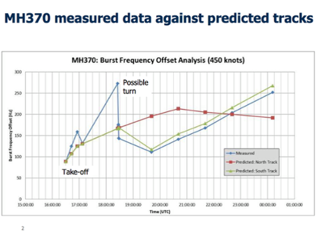
(Me: March 26) PS: how does one read this graph? Where is the "zero" of the frequency shift corresponding to the plane at rest. The Doppler frequency shift has to cross the zero axis because it went from flying away from the satellite to flying towards the satellite for a part of its course. But I don't see where to put the zero on the y-axis. You might think it should pass through the "take-off" point but that doesn't work.The corrected graph:
So how could Inmarsat claim to distinguish between a northern and southern path at all? The reason is that the satellite itself wasn’t stationary. Because the satellite was moving north-south, it would have been moving faster toward one path than another—specifically, faster toward a southbound track than a northbound one over the last several hours of the flight. This means that the frequency shifts would also differ between a northbound and southbound path, as the graph shows with its two predicted paths.
But this is actually where the graph makes the least sense. The graph only shows different predicted values for the north and south tracks beginning at 19:40 UTC (presumably Inmarsat’s model used actual radar before this). By this time, the satellite was traveling south, and its southward speed would increase for the rest of the flight. The frequency shift plots for northern and southern paths, then, should get steadily further apart for the rest of the flight. Instead, the graph shows them growing closer. Eventually, they even pass each other: by the end of the flight, the graph shows the satellite traveling faster toward a northbound flight path than a southbound one, even though the satellite itself was flying south.One ping alone is damning. At 19:40 UTC, the satellite was almost motionless, having just reached its northernmost point. The graph shows a difference of about 80 Hz between predicted northbound and southbound paths at this time, which would require the satellite to be moving 33 miles per hour faster toward the southbound path than the northbound one. But the satellite’s overall speed was just 0.07 miles per hour at that time.Inmarsat claims that it found a difference between a southbound and northbound path based on the satellite’s motion. But a graph of the frequency shifts along those paths should look very different from the one Inmarsat has produced.