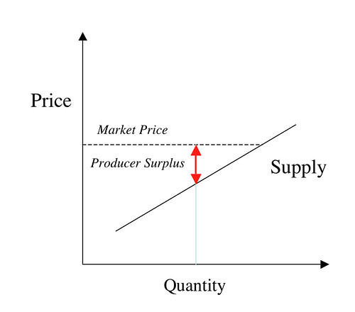
The chart above depicts the theoretical supply curve for some commodity. For simplicity it is shown as a straight line. As the price in the market increases, the quantity available for sale will likely increase, and so the the curve has a positive slope.
What determines how much supply will be there for a given price? Well, for a quantity like that shown on the graph and the price as shown (Market Price), the producers have a surplus. It is advantageous for the producers to put additional supply on the market. Of course, as they do so, the costs to themselves tend to increase, and so the surplus eventually goes to zero. At that point, producers will not put any more supply on the market, and you've got a point on the supply curve.
In reality, given the nature of production, the supply curve for any one producer probably looks like this, a staircase.

Once the price crosses a threshold, it is economical for the producer to add on certain production capacity. Incremental costs of increasing production remain constant upto a certain point, so the producer will put as much as they can on the market. The overall market is a sum over all producers who have different staircase curves. Looked at a fine scale, a sum of staircase curves remains a staircase. However,
1. A smooth curve is a good enough approximation. The uncertainties/errors of measurement of the staircase is probably larger than its discontinuities.
2. Doing efficient market theory becomes mathematically very inefficient without this approximation.
______________
We can in a similar way, look at the demand curve for the commodity. In this case, as the price goes up, we expect the amount consumers are willing to buy goes down, and the demand curve has a negative slope.
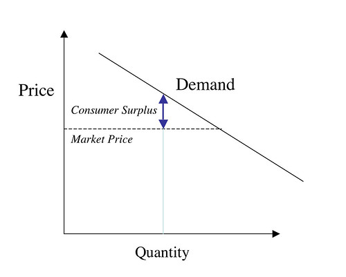
In exactly the like fashion as in the supply curve, we have the notion of a consumer surplus. Consumers keep buying until at some point, the benefit to additional purchases among consumers is zero.
Putting it all together, we have the efficient market equilibrium.
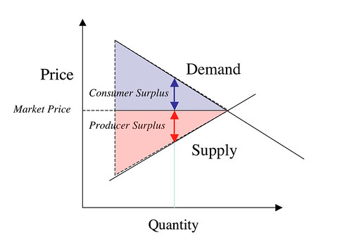
The colored areas - which really should extend all the way to the price axis - represent the net benefit to the economy (the consumers and producers) at this equilibrium. Every consumer that had a benefit that still existed at the market price makes purchases, those purchases that had no economic benefit (at the market price) for the consumers don't happen. Similarly only the sales that had a net benefit for the producers happened.
Now suppose something (some government intervention) moves the market away from its efficient equilibrium. A situation like that below might obtain (it is one of several possible scenarios. In general, both the supply and demand curves will move from their efficient market instances. In my diagram, we simply moved along the efficient market curves.) The quantity sold/consumed and the price at which it is consumed is represented by the point C.
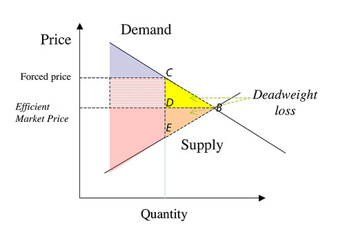
Because of the higher price, the demand quantity is lower than it could have been. The yellow and orange colored areas are the net loss to the economy because it is no longer efficient. The technical term, I believe, is deadweight loss. One or both of those triangles BCD or BDE, or the overall large triangle BCE is the Harberger triangle(s) (pure reason does not enable one to determine which.)
BDE represents lost value to the producers, BCD represents the lost value to the consumers, compared to the efficient market scenario. The hatched area between the Forced Price and the Efficient Market Price appears to be a loss to consumers or gain to producers. It depends.
Suppose the departure from the market equilibrium is because the government imposed as sales tax. One would expect the tax to be partly borne by producers and partly by consumers. I think (but can't currently prove) the price received by the producers is represented by the price at point E, the price paid by consumers is represented by the price at point C, and the ratio of the burden of sales tax on consumers to producers is CD/DE. The revenue collected by the government is represented by the rectangular region to the left of the line segment CE.
Suppose C was the price set by a monopoly. C would be set by the monopoly producer maximizing price * quantity, with C on the demand curve. BCE still represents the loss to the economy compared to the efficient case. In this case the producer is reaping additional benefit represented by the hatched area minus BDE.
Overall I don't understand what Yglesias is writing. Maybe CIP or someone will be able to explain.
PS: I think BCE is The Harberger Triangle.
PPS: Wiki is unclear. They seem to imply government revenue is represented by some fraction of the Harberger triangle. But it seems to me that BCE represents economic activity that simply doesn't take place - it doesn't represent government revenue. Now I'm totally confused.
PPPS: Uncharitably, I tend to think Yglesias is the hopelessly confused one. When I read Krugman's paragraph that started off Yglesias, then it doesn't seem to be saying anything like what Yglesias or Wiki writes. The Harberger triangle is not captured by government revenues, etc.
Now, a key point in all this is that the emissions tax or, equivalently, the rent on emissions permits, does not represent a net loss to society. It’s just a transfer from one set of people to another — from the emitters, and ultimately those who buy their products, to whoever collects the taxes or gets the permits, and ultimately whoever benefits from the revenue or rents thus generated. The only net loss is the Harberger triangle created by the reduction in emissions — which has to be set against the benefits of reduced pollution.
To Krugman's larger point: not taking into account the costs of pollution (i.e., assuming that the efficient market is one in which pollution is costless) is a mistake. I.e., today's "efficient market" really embodies a pollution subsidy.